Project Overview
Client
Touchstone Facility Group
Role
Art Director & Designer
Project
Brand Refresh
Year of Completion
In progress
Touchstone Facility Group (formally known as Advanced Building Maintenance) is a well-established, family-owned janitorial business with more than 25 years of experience servicing corporate offices in the San Jose area. When I first met the founders, they shared their journey of working with many designers in the past, yet never quite finding the perfect logo.
They were very clear on not wanting a illustrated logo of a mop or cleaning items of any kind. They wanted something sophisticated, clean, professional, friendly and modern. I was excited to take on the challenge and create a logo they absolutely loved, one that even their friends and family gave a thumbs-up to. Check out the start of Touchstone Facility Group's exciting new chapter below!


A new logo that reflects a new journey.
Representing a modern and fresh aesthetic, the new logo aims to position TFG to attract a broader customer base. Conversations with the founders revealed their vision for a brand identity that harmoniously blends technological elements with a friendly appeal, specifically targeting the millennial demographic.
Wordplay
Inspired by the word "Touchstone," my initial concept for the logo involved the creation of simple, touching stone shapes. I believed that a minimalist approach could be effective, so I began exploring how to integrate these elements within the wordmark. The letter "o" in "Stone" naturally lent itself to this concept, providing an ideal space to visually represent the two stones coming together.
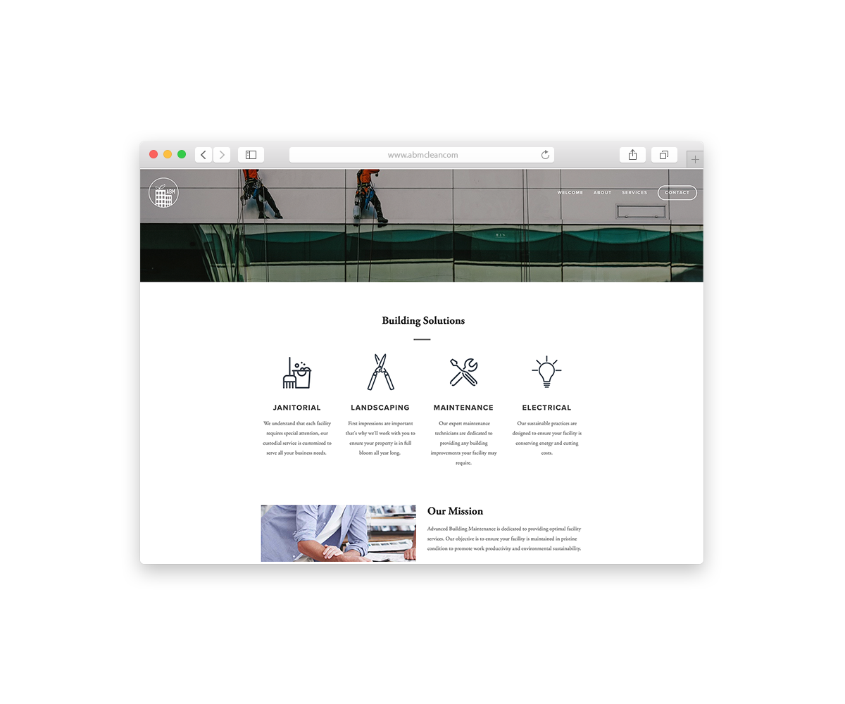
Old Logo

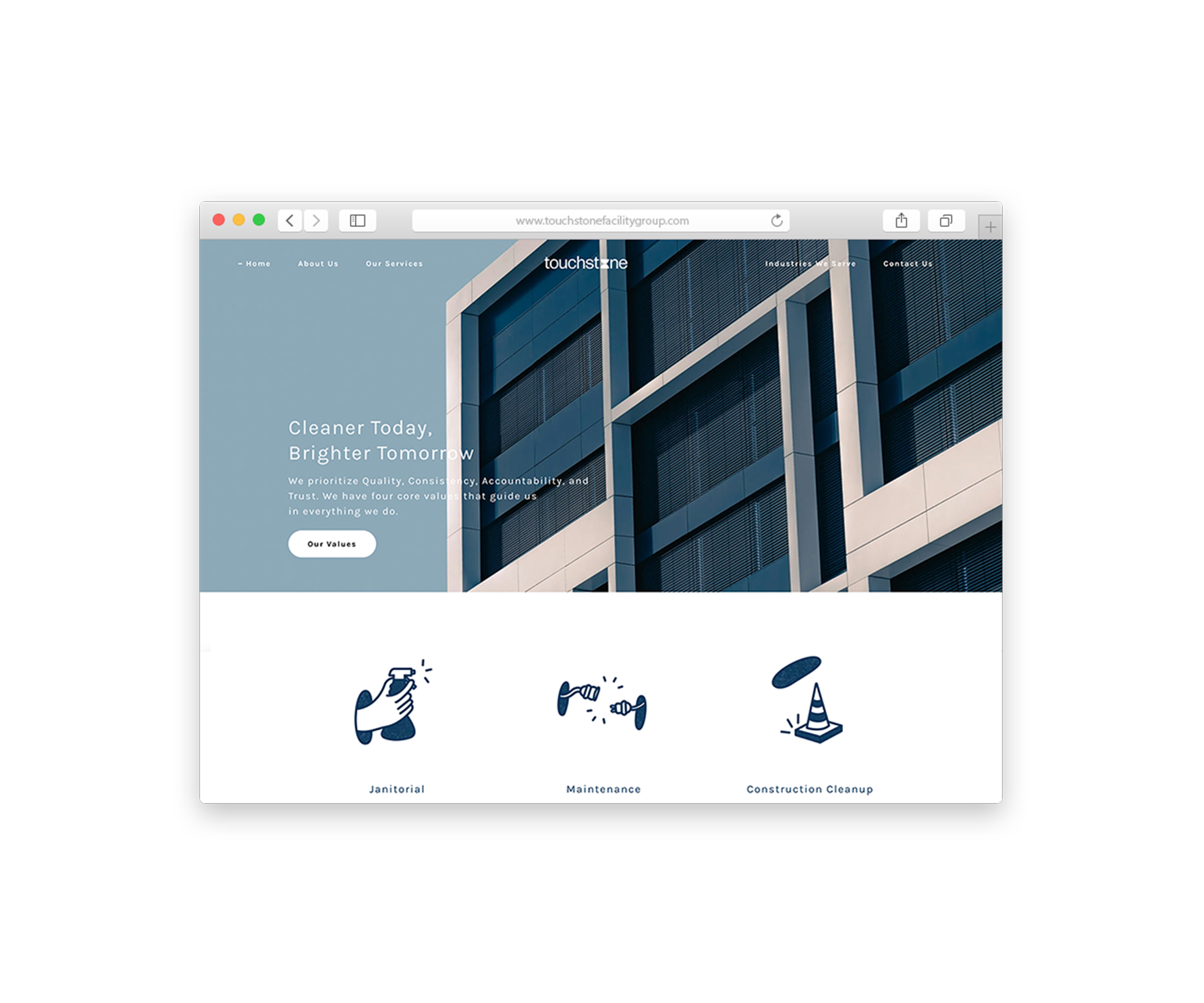
New Logo

Playing with shapes, the Bauhaus way
Continuing with the simplicity established in the logo's two shapes, I sought to maintain a clean brand aesthetic. The Bauhaus style offered a straightforward framework for this, guiding the selection of only squares, circles, and half-circles. The addition of cool blue hues was a deliberate choice to further reinforce the desired friendly, clean, and modern impression.

Website Redesign
The website is in progress but I continued with carrying over the new brand design.