Project Overview
Client
Touchstone Facility Group
Project
Brand Refresh
Role
Senior Graphic Designer
Year
2025
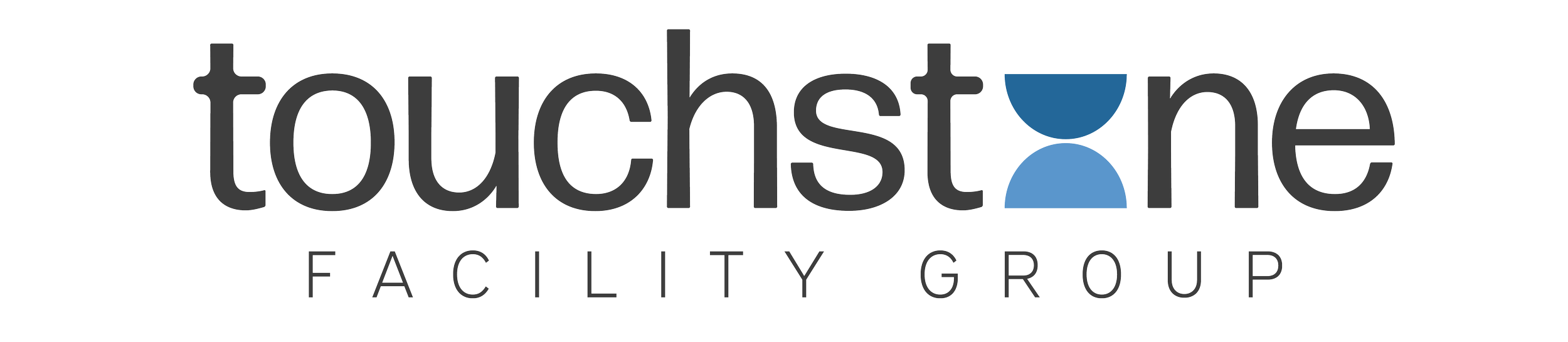
Touchstone Facility Group (formally known as Advanced Building Maintenance) is a well-established, family-owned janitorial business with more than 25 years of experience servicing corporate offices in the San Jose area. When I first met the founders, they shared their journey of working with many designers in the past, yet never quite finding the perfect logo.
They were very clear on not wanting a illustrated logo of a mop or cleaning items of any kind. They wanted something sophisticated, clean, professional, friendly and modern. I was excited to take on the challenge and create a logo they absolutely loved, one that even their friends and family gave a thumbs up to. (Check back soon for more completed Touchstone projects.)
-
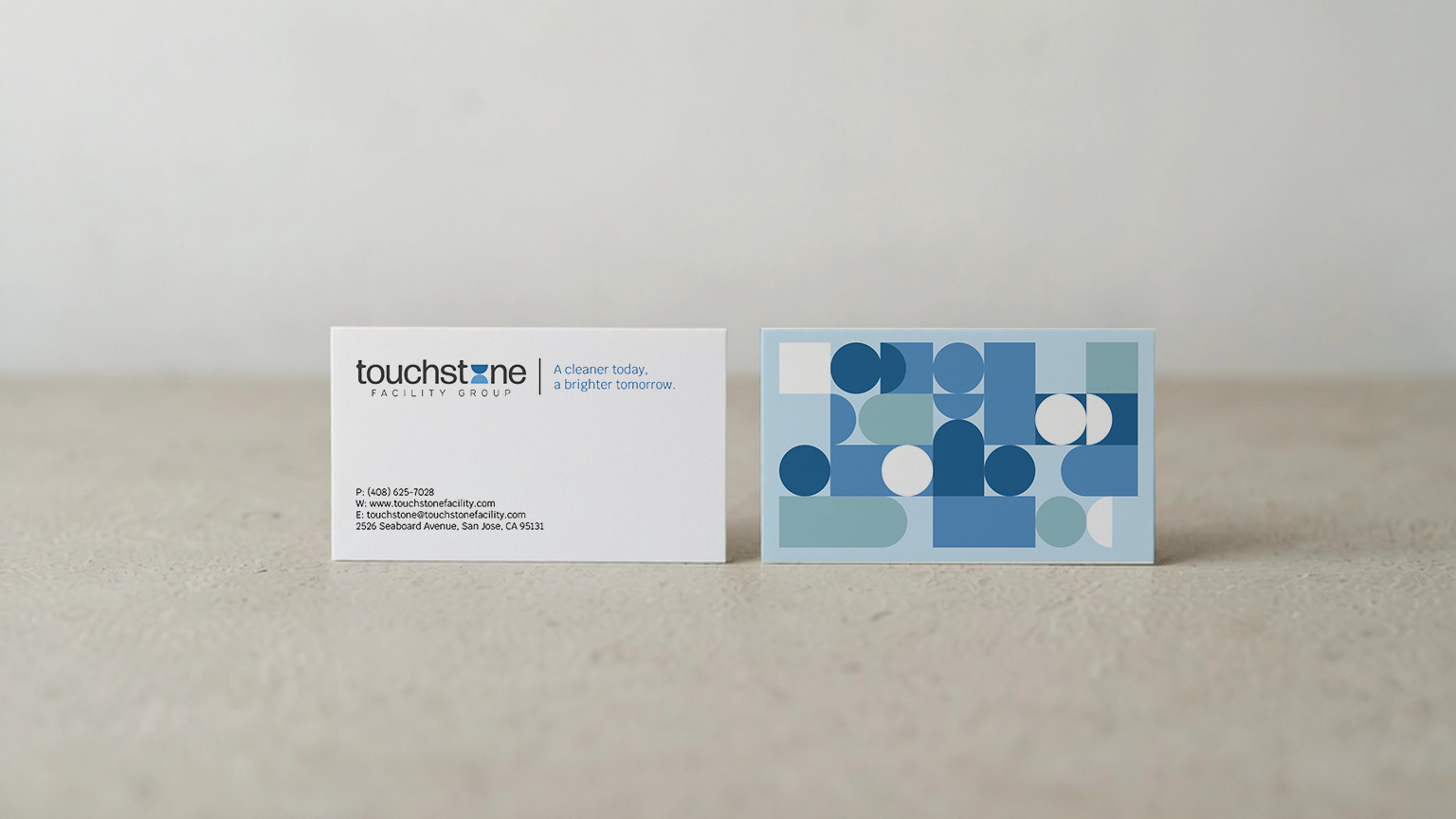
Establish a brand identity that is clean, modern, and possesses the sophistication to attract corporate clients while remaining accessible to small businesses.
-
Create a unique brand identity that moves beyond typical cleaning-related imagery and iconography.
-
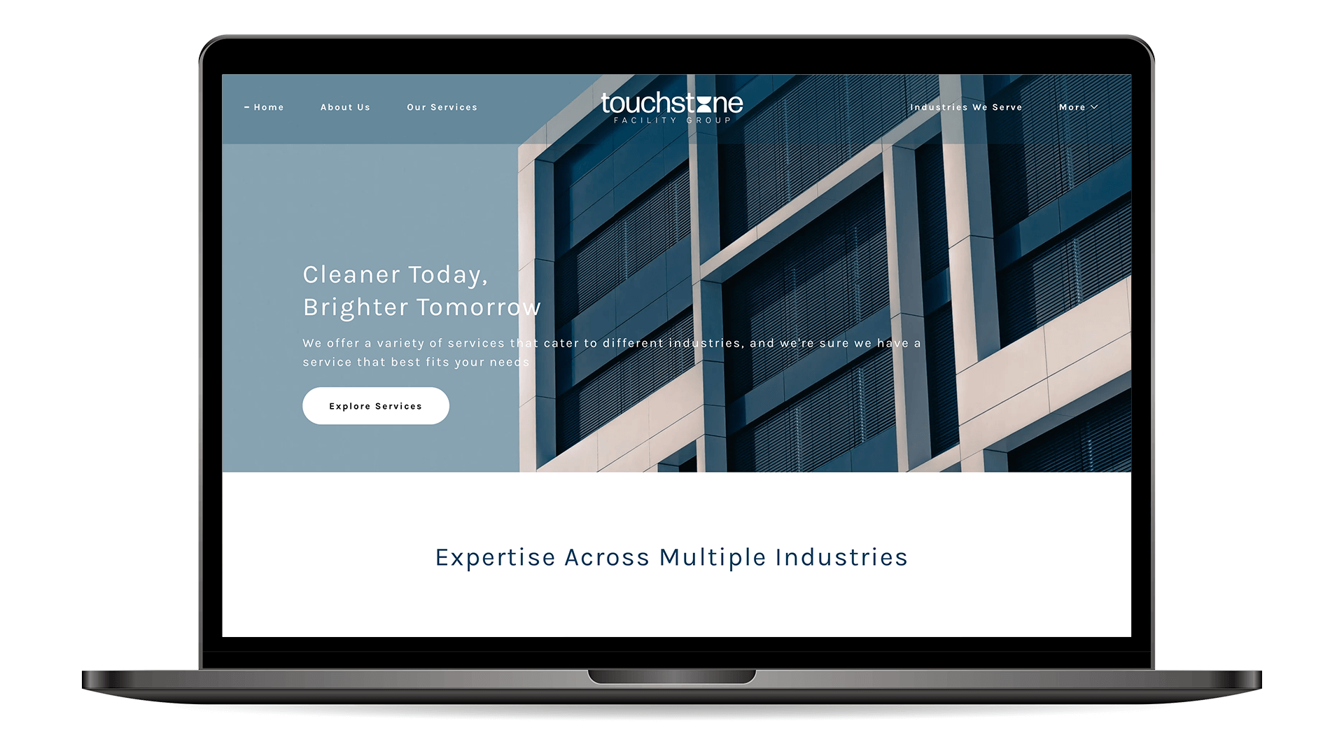
Thanks to a new brand identity and an updated website, potential customers can now readily explore Touchstone Facility Group and the services they provide.